Home > Blog > Introducing the Craft.io Progress Dashboard
Introducing the Craft.io Progress Dashboard
Analyze Your Progress by Item Count, Team, Sprint, Key Results, or Whichever Metrics Matter to You
At Craft.io, our mission has always been to give product teams and leaders the tools they need to make the best-informed decisions for their products’ success. And as a product professional yourself, you know that one of the most valuable tools available to any product team is visibility.
That’s why, for example, we created Craft.io’s capacity planning and product portfolio management tools. The more visibility you have into where your resources are allocated – even across product lines – the more effectively you can plan initiatives, make smart prioritization decisions, manage dependencies, and direct your resources to higher-value projects.
For any product team, visibility is business intelligence.
And that’s why we’re thrilled to introduce you to our newest visibility-enhancing tool: Craft.io’s progress dashboard.
The progress dashboard offers a responsive, visually intuitive way to view and analyze any of the product-related data in your Craft.io environment. Here are just a few ways you can use this new feature to gain valuable insights into your progress on any of your company’s products.
1. Track and analyze all of your product data.
With the progress dashboard, you can monitor and analyze where your company stands in terms of virtually any type of product-related goals, plans, and metrics. For example, you can track your progress by:
Time-based metrics:
- Quarter
- Year
- Sprint
Items on your product hierarchy:
- Product
- Epic
- Story
Teams and individuals:
- Assigned team
- Assigned team member
- Assignment created by
Success metrics:
- Objective
- Key result
- Item value
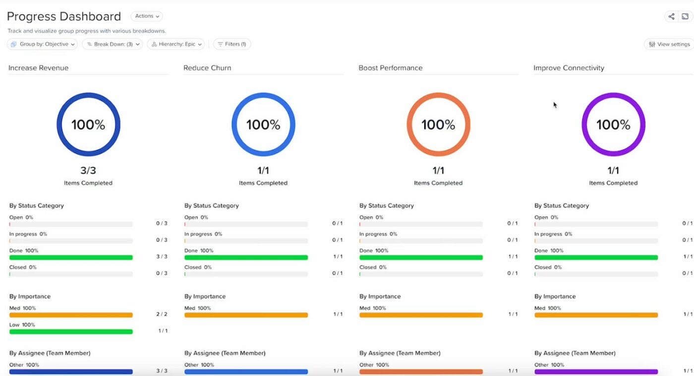
The screenshot below depicts an example of the dashboard displaying both the high-level and more detailed views of progress on several objectives.

2. Drill down for granular analysis on any progress category.

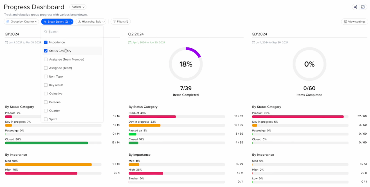
Let’s say you’re tracking your overall progress for a couple of quarters. As you can see in the screen above, those high-level numbers will display at the top of your progress dashboard as percentages in a pie chart. This is great for gaining an at-a-glance update of your overall progress.
If you want a more detailed view of what each high-level percentage means, you can go into the “Break Down” section and select any of the specific categories you’d like to view to see how they’re affecting the top-line number. These could include the item types, assignees, objectives, key results, importance, etc.
You’ll then see those details displayed on your screen below the pie chart, with each item quantified to show you where your company stands in terms of its progress and how it’s influencing your overall progress. If you’re using the “Simplified” tracking method, as shown above, you’ll see a ratio beside each item, which indicates how many items the team has completed out of the total assigned.
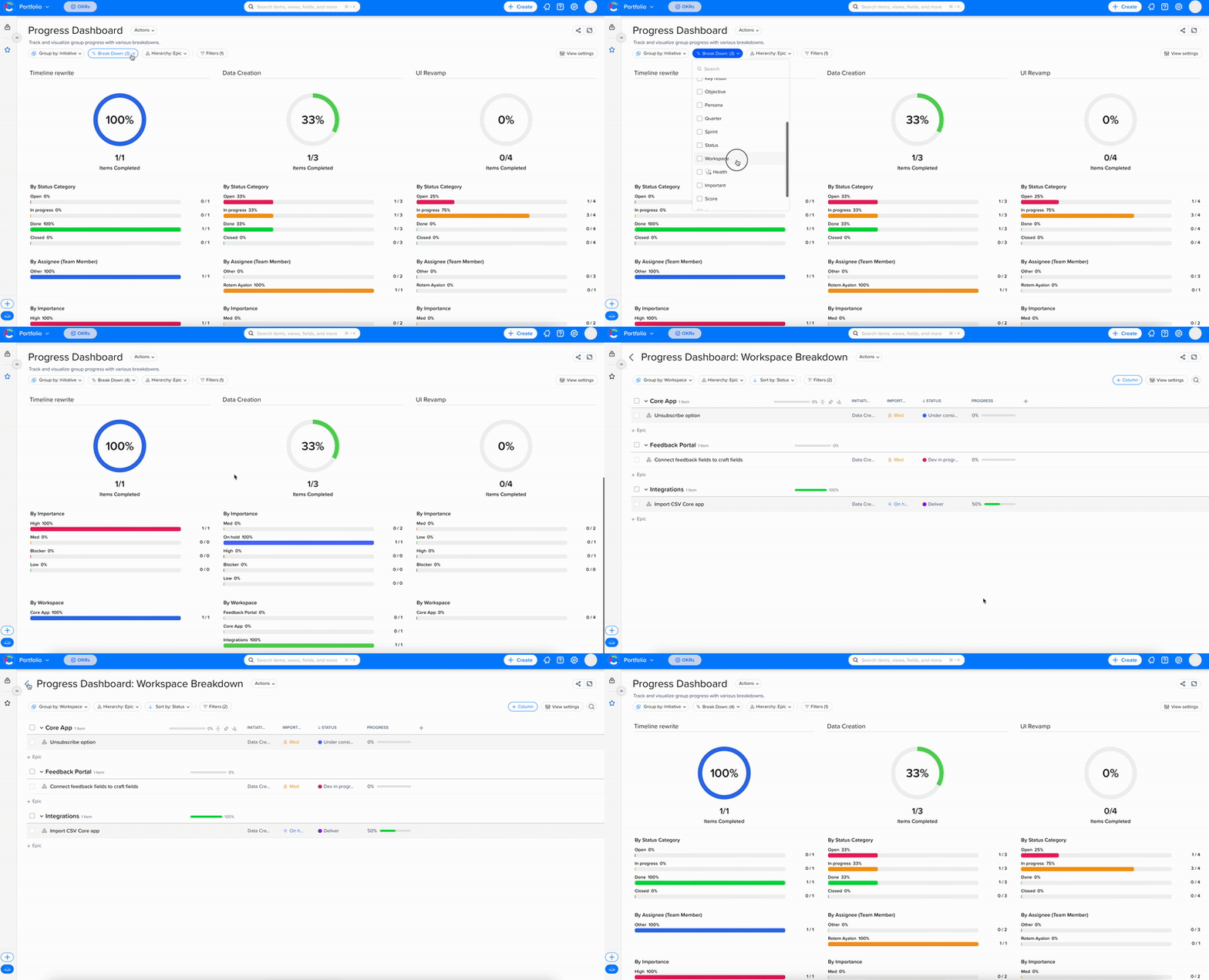
But the Craft.io progress dashboard can give you an even more granular view of your progress. By clicking the “Drill Down” option available with any of these breakdown categories (“By assignee,” “By importance,” “By sprint,” etc.), you can bring up a detailed view of each of that category’s individual tasks – again, with a quantifier indicating its current progress. This could be an items-completed ratio (34/92, for example) or a percentage complete.
As you can see from the image below, if you viewed your progress by teams and then selected the “Drill Down” option for your QA team, you’d see how that team was progressing on each task assigned to it – reviewing the chat function, reviewing the permission settings, etc.
This dataset can provide you with strategically valuable insights. If you find, for example, that your teams have completed a high percentage of “Low Importance” items and only a relative handful of items marked “High Importance,” you’ll know that you need to pull the team together and help them shift their efforts to the higher-value tasks on their to-do lists.
3. Analyze and act on progress data across your product portfolio.

We’ve also applied all of these progress tracking and analysis capabilities to Craft.io’s portfolio management platform.
That means product leaders can deploy the progress dashboard to gain granular visibility into where their entire product organization stands at both the high and granular levels.
Product leaders can use the progress dashboard, for example, to gain an at-a-glance view of all of their workspaces, as well as all (or some) of their product teams, product lines, and individual products – and analyze how well each of these initiatives are advancing toward their goals.
And just as with the capabilities we described above, which apply to the individual workspace, this portfolio-level progress data is designed to be actionable. Product execs can use what they learn analyzing the progress dashboard – for example, that certain teams are completing more items per sprint than other teams – to gain important insights into what’s happening across their organization and reallocate resources accordingly.
Start Benefiting Now from the Craft.io Progress Dashboard
Craft.io’s new progress dashboard is now live within our end-to-end product management platform. If you’re not already using our award-winning solution, try Craft.io for free.
And if you’re interested in learning more about what the progress dashboard can do for your team, book a demo with a Craft.io product executive.

