Prioritization frameworks: smarter product decisions

Product managers and prioritization frameworks go hand-in-hand like rice and beans, peanut butter and jelly, or bread and butter. We could go on with the food metaphors, but we think you get our drift: prioritization is a top concern for PMs. Whether it’s feedback, requests, or new opportunities, the backlog is a repository for everything you could be doing. But the age-old question persists: What should we be doing? Answering that question (and those that follow, such as how, when, and why a feature should be considered for development) requires product managers to carefully and rigorously assess multiple factors. Resources, risk, impact, and revenue: each criterion must be carefully and objectively evaluated to yield the most effective and efficient prioritization.
So with a constantly growing backlog and various stakeholder demands to be juggled, how can product managers best make sense of what goes first, what should wait, and what can be dismissed altogether? In this article, we’ll outline seven commonly used prioritization frameworks, highlight their benefits, and discuss how they can help you effectively analyze resource allocation.
RICE
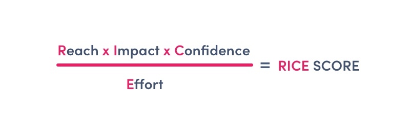
Developed by Intercom’s product team, RICE was created to provide product managers with a comprehensive framework that objectively compares feature importance based on actionable metrics and numbers. The RICE acronym stands for Reach, Impact, Confidence, and Effort and works based on a simple formula: Reach * Impact * Confidence / Effort. This formula allows you to calculate a prioritization score based on how many people the proposed feature will reach within a specific period, how much the feature will impact individual users, and how confident you feel about the accuracy of those impact and reach estimates. The final element, effort, identifies the total amount of time various product teams (product, design, development) require to deliver the feature.
Scoring features using RICE can get a little convoluted, so to simplify things, a tiered scoring system can help with certain elements. For example, when scoring Impact, a five-tiered scoring system such as the one below helps PMs to more easily assess individual requirements. Similarly, with Confidence, a three-tier system is adopted so that less time is spent trying to pinpoint a subjective number between 1 and 100 (a process undoubtedly tinted by personal bias).
| Impact Scoring Tiers | Confidence Scoring Tiers |
|---|---|
| 3 = massive impact 2 = high impact 1 = medium impact .5 = low impact .25 = minimal impact |
100% = high confidence 80% = medium confidence 50% = low confidence |
Your final RICE score allows you to compare opportunities based on which will provide the most value compared to their effort. The bigger the final score is, the higher the priority. The RICE framework is typically more helpful when looking at existing, mature products than MVPs (that have yet to accumulate the reliable data to be plugged into the RICE formula). Through its scoring system, RICE provides product managers actionable metrics and numbers that balance quantified effort with customer satisfaction.

craft.io automatically calculates your RICE score, making it quick and easy to share and communicate this framework to stakeholders.
Kano
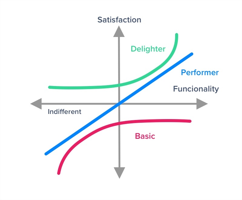
Developed in the 1980s by Japanese researcher Noriaki Kano, the Kano model looks to prioritize features based on user satisfaction. At its core, the Kano model describes three types of requirements based on customer preferences: Basic Requirements (expected by the customer), Performance Requirements (desired by the customer), and Attractive Requirements (those which delight the customer). The data is gathered from customer satisfaction questionnaires, then plotted against an X/Y axis, where X is Feature Implementation, and Y is User Satisfaction.
The Kano questionnaires are effective at highlighting precisely what a customer values (or doesn’t value). Two questions frame each requirement: one asks how they would feel if they had the feature, while the second asks how they would feel if they didn’t have the feature. The customer then selects one of the five available response options:
- I like it
- I expect it
- I’m neutral
- I can tolerate it
- I dislike it
The Kano questionnaire is frequently accompanied by qualitative interviews, which aid in further adding color to understanding why customers desire certain features. While this type of prioritization framework does not provide insight into the effort/resources required, it helps to clearly identify product opportunities and gaps in the market, as well as validate how important features are for the end-user.
MoSCoW
Considered one of the simplest prioritization frameworks, the MoSCoW framework was developed by Dai Clegg and used extensively within the DSDM framework. The acronym stands for “Must, Should, Could, Won’t”, describing the four quadrants of the framework:
Must: Mandatory features that must be delivered for the release to be considered a success.
Should: These features are considered great to have, but are not critical to the release delivery as they are often not time-dependent.
Could: Non-critical, small-scale improvements that, while not essential, are typically included if time and resources permit.
Won’t: Of the lowest importance, these features are considered by stakeholders as the least-critical, lowest-payback items, or not appropriate at the current release.
These four groups allow for a logical evaluation of each feature’s importance, making it easy to communicate priorities to stakeholders. The MoSCoW framework is a particularly powerful prioritization tool when used in a collaborative team setting. Hashing out which feature belongs to which quadrant and why it belongs there can facilitate rapid alignment and can generate some compelling discussions. Using MoSCoW in this way can help product managers frame conversations with stakeholders while simultaneously directly engaging them in the prioritization process.
While MoSCoW benefits both new and mature products, it’s important to note that this framework provides a general broader overview of prioritization, and does not rank competing requirements or clarifies timing.
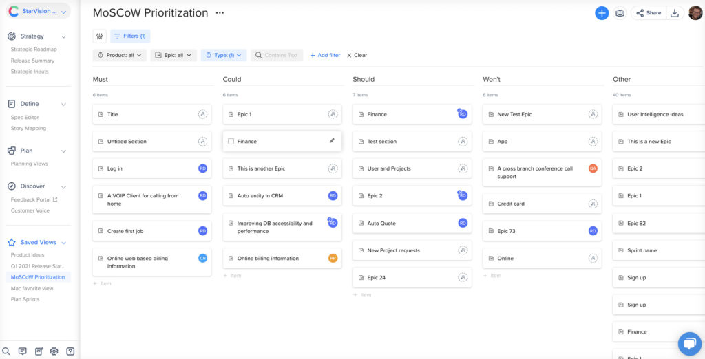
The MoSCoW Prioritization Framework set up on craft.io makes it easy to quick discern Feature priorities.
Value vs. Effort
Another simple approach, the Value vs. Effort prioritization framework (also known as Value vs. Complexity), takes each feature and assigns it an estimated business value and an estimated complexity value. The final prioritization score is achieved by dividing the two (value/effort = score). The individual scores are then plugged in a table for comparison or alternatively, plotted into four quadrants (typically labeled Quick Wins, Big Bets, Maybes/Incremental Improvements, and Money Pit/Time Sink).
Your Value score takes into consideration things like brand awareness and customer satisfaction, while your Effort/Complexity score takes into account factors like operational costs, developer hours, time on the schedule (days, weeks, months), customer training, and risk.
When using this framework in table form, like in craft.io, the assigned numerical values for value and effort get automatically divided to generate a single prioritization score, providing PMs with a clear and immediate indication of what’s worthwhile pursuing and what can be eliminated. The Value vs. Effort prioritization framework is a powerful tool, but as it’s affected by cognitive bias, it should also be used cautiously to avoid overestimating impact and underestimating effort.
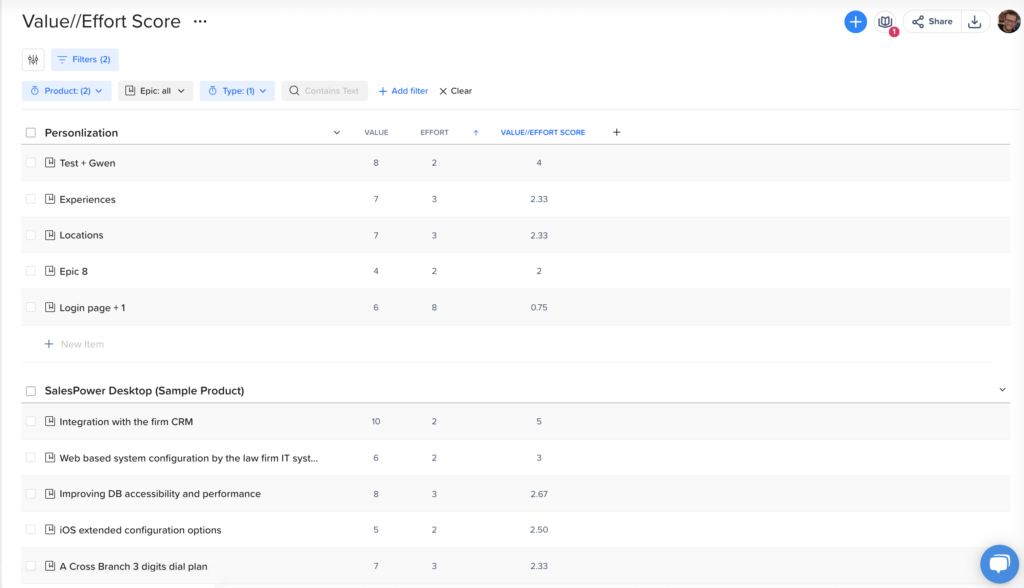
Once the final value/effort score is automatically calculated in craft.io, Features can be easily sorted by ascending/descending order.
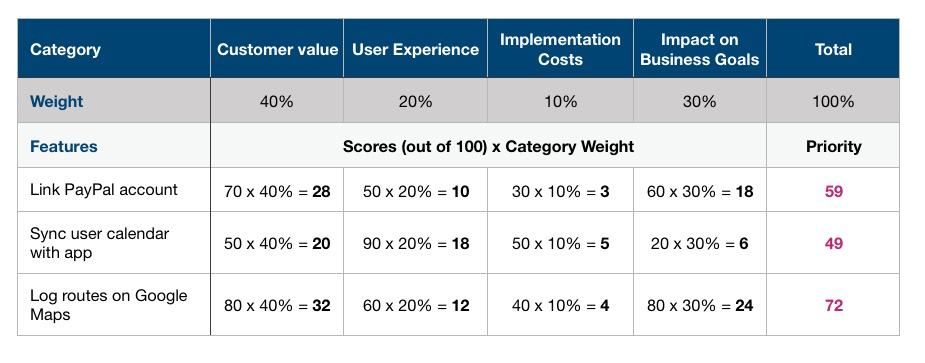
Weighted Scorecard
A Weighted Scorecard prioritization framework allows you to determine which features should be pursued based on evaluating specific criteria required to deploy that feature successfully. Stakeholders decide together which criteria or categories will make up the scorecard (e.g., Customer Value, User Experience, Implementation Costs, and Impact on Business Goals).
Each category is then assigned a weight percentage, with this value corresponding to how important it is to the overall product management process. To plug a feature into the scorecard, assign it a value out of 100 in each of the category columns, and then multiply that number by the weight given to that category and add those figures together to give you the final scoring of that feature (e.g., 70*40% + 50*20% + 30*10% + 60*30% = a final scoring of 59).
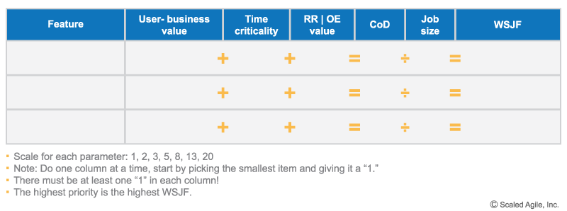
WSJF
Weighted Shortest Job First (or WSJF) is a prioritization framework popularized by the Scaled Agile Framework (SAFe). The technique utilizes a simple equation: Cost of Delay / Job Duration = WSJF Value.
The Cost of Delay can be estimated by calculating the value of three factors:
- Value to the business and/or user: How much revenue will this generate? How highly is it requested by customers? Will it result in cost reduction for the business?
- Time criticality: How do deadlines, milestones, or competitors impact the value of this solution?
- Risk reduction and/or opportunity enablement: What other implications does this have on the business? Does it reduce future risk or open up new business opportunities?
Once the above factors are estimated for each feature, add them up, and then divide this number (your Cost of Delay) by the estimated Job Duration value to obtain the WSJF value. Once done, prioritize your feature from highest to lowest WSJF value.
Story Mapping
Coined by Jeff Patton, Agile & Scrum Master veteran, story mapping takes a top-down approach to prioritization and helps you effectively visualize user stories. This collaborative methodology requires the team to use sticky notes/index cards on a wall or floor to identify the user’s journey in sequential order.
- On a horizontal axis representing time, plot Goals/Activities (interchangeably known as themes and epics) to sequentially represent how users interact with your product. This provides a narrative flow and is known as the Backbone of the story map.
- Below the Backbone is where you hash out the details. On this vertical axis representing priority-level, plot Tasks/Stories beneath their respective parent category. This includes sub-tasks, alternative tasks, exceptions, and technical details.
- Finally, dividing the content of your story map into lanes allows you to categorize them into Release Slices and sprints.
The big benefit of story mapping is that it’s inclusive, interactive, and collaborative. In addition, this prioritization framework helps PMs avoid the flat-backlog scenario (essentially a one-dimensional to-do list), and prioritize based on the big picture and user experiences/needs. On the flipside, story mapping is a highly iterative and time-consuming exercise that fails to consider external factors like business value and complexity.
Prioritization frameworks help make a PM’s life that little bit more organized– they provide the tools to objectively evaluate how to best allocate resources and mitigate risks. Still, these assessments should never happen in a vacuum. Each of the prioritization frameworks discussed above requires that your plotting, scoring, and calculating is informed by the overall product strategy so that the prioritization outcomes are always aligned with the larger product vision.
Finally, it should be noted that more often than not, these prioritization frameworks are not mutually exclusive and often work best when used in tandem with one another. Doing so will help you not only get a more holistic view of which features should be prioritized next but will also provide you with the right visual aids to engage, persuade, and align your stakeholders.
RICE, Kano, MoSCoW, Scorecards, and other prioritization frameworks can all be created directly in craft.io, allowing for seamless feature prioritization and sharing with stakeholders. Try craft.io for free for 14 days to improve your team’s prioritization and ditch those spreadsheets for good.
CEO & Co-Founder, craft.io
